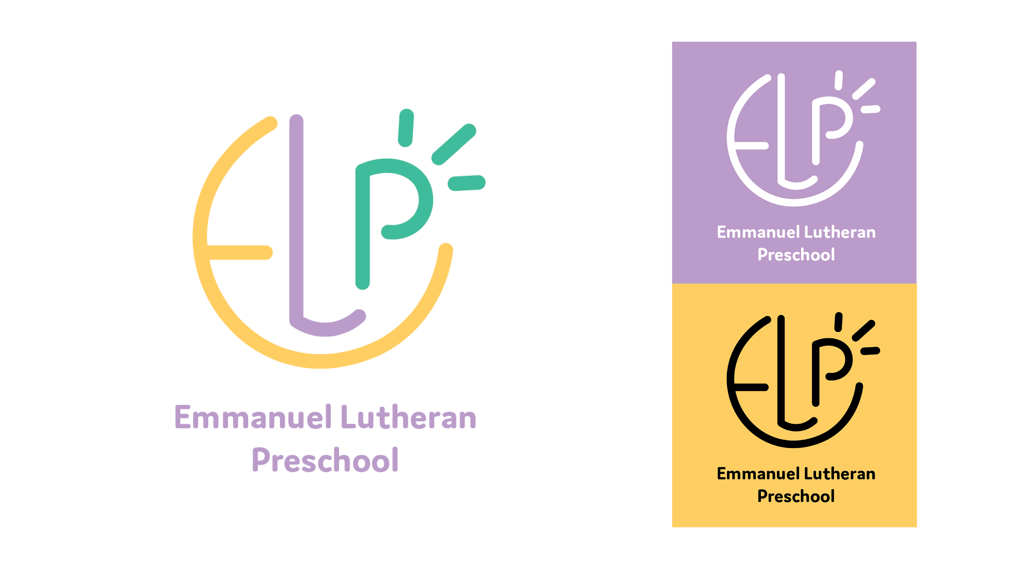
For their logo I took advantage of pareidolia, which is what allows humans to see faces in everyday objects. The clean and professional logo appeals to parents, while the face in the logo appeals to their childrens' imaginations.
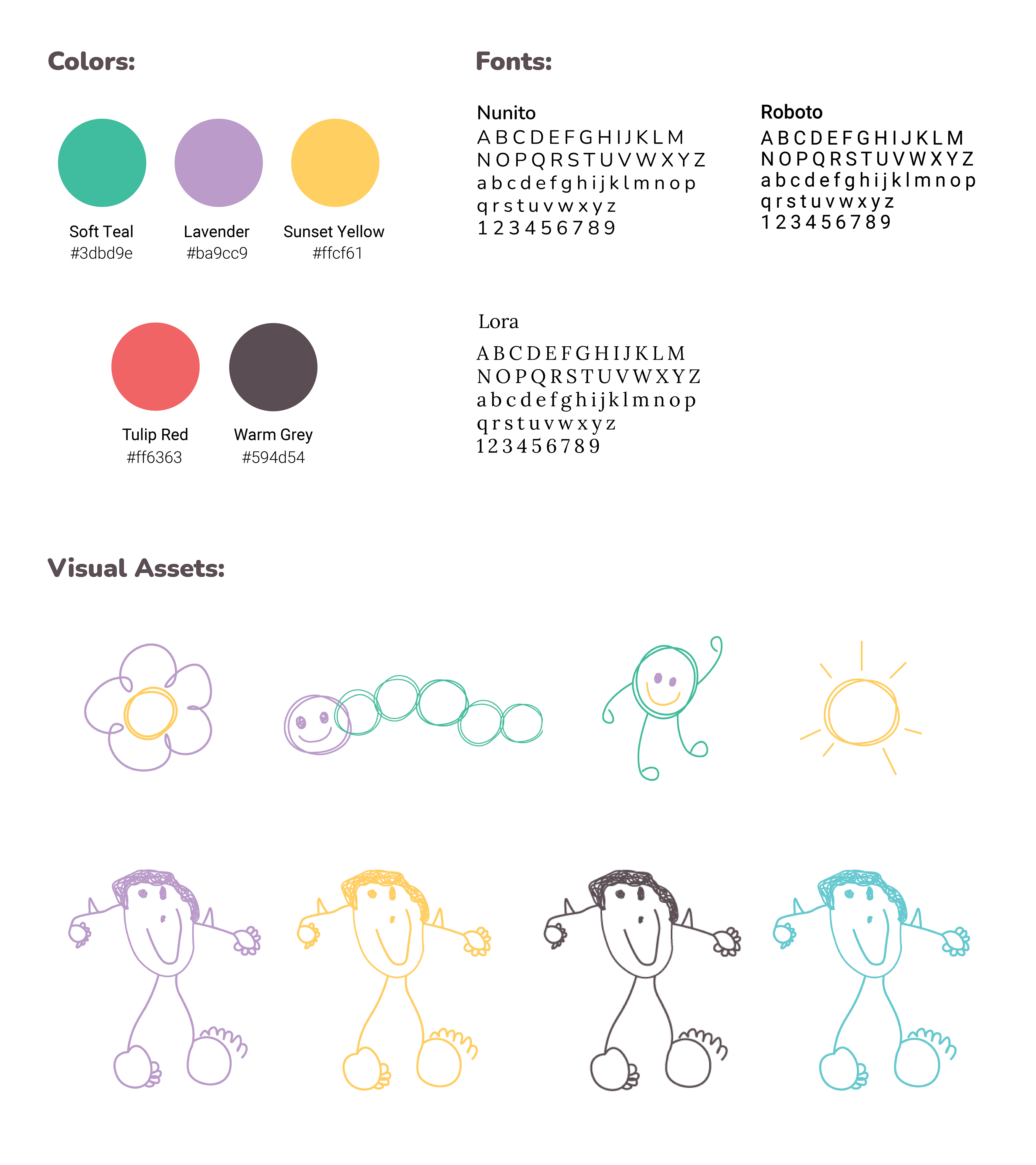
The brand colors are a more soft and welcoming variation of the traditional primary colors. I chose fonts that felt friendly to match the identity of the brand. Previously, ELP had been using an icon based on a child's drawing as a logo. I vectorized this icon and provided iterations with the brand colors so they could continue to use this as a visual identifier. I used the theme of children's drawings to create additional icons.
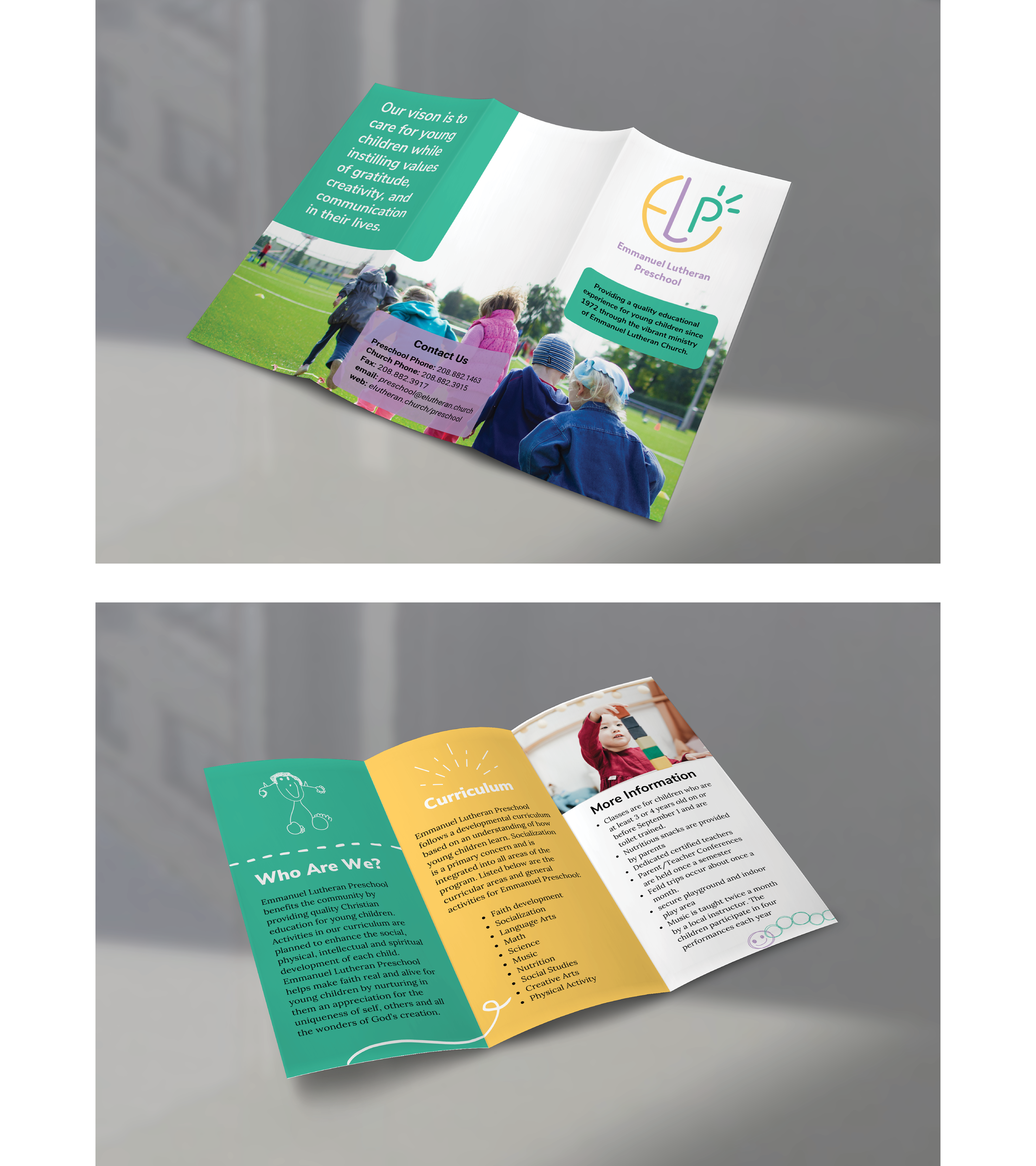
ELP creates a brochure for each school year to keep parents up to date, so I provided a template on Canva so they can easily modify it when needed.