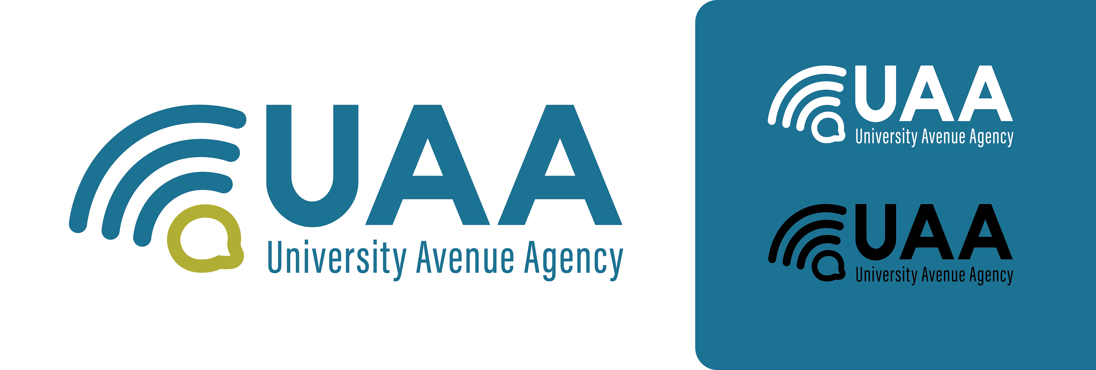
Our team wanted our services to be visually represented in the logo so I created an icon that showed that UAA was an agency focused on outreach and communication.

Because UAA would offer a wide variety of services, we wanted a logo alternative for smaller spaces so I created a tile version. There are two main brand colors with lighter alternatives to give designers the ability to add contrast. Most communications should only use the main brand colors, but the secondary colors were added for occasional use such as detailed illustration work.
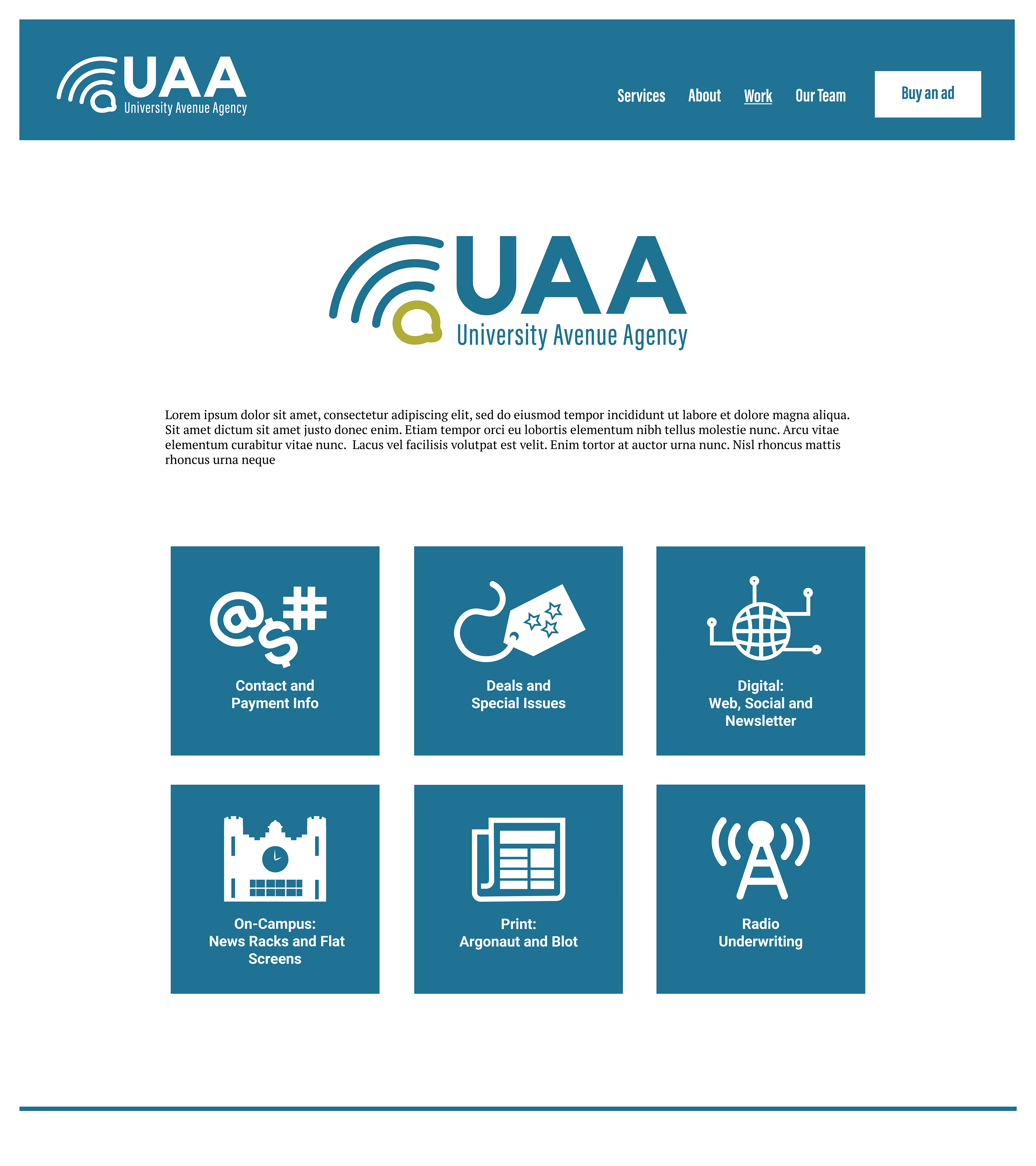
The team needed a simple web design that could be easily updated by students and staff. I created a mockup with a clean aesthetic and easy navigation. I also created visual assets for the site, like these button icons for UAA's different offerings.